Musings on Pantone's Color of the Year 'Living Coral’ 2019, guest blog by Gillian Rose, the Science of Color
As a color scientist and interior designer, it is not color trends nor color marketing that I or my colleagues take issue with; there are places for all color information within our society; color encompasses all.
“ Color is Democratic. It should not be a luxury, it should be like water + air.” - Picasso
At its best, predicting and establishing color trends falls under ‘sociology’ and at its greatest commodity, ‘commerce.
‘Living Coral’ is an interesting choice for our time. We are in the midst of fighting to have Global Warming remain as one of the greatest fundamental survival issues, that require immediate action. Losing our coral reefs to bleaching due to greenhouse gasses are at an astonishingly dangerous rate.
Dezeen issue 12.10.18 published ‘Pantone's Living Coral shade can't be a harbinger of positivity’, says Michelle Ogundehin, 'when real coral reefs are being devastated by global warming’.
Then there is the actual color hue, description itself. Pantone announced, 6 December, the Living Coral color is described by Pantone as an "animating and life-affirming coral hue with a golden undertone that energizes and enlivens with a softer edge".
I realize typically when reading about 'color affects', the only responses addressed are those of a cognitive and associative nature. Neuroscience defines many more processes. Our initial responses to color are physiological - not merely cognitive. They are involuntary physiological reactions to the wavelengths (vibrations) to each and every color we experience at all times.
Getting back to our associative responses to coral; there are many adjectives that describe this color. Coral = Softer edge, can not be thought to be one of them. While coral is clearly softer than traffic cone orange, any time orange (red+yellow) are involved, soft will simply not be a response we have.
Traffic cones are orange for good reason. Orange is assertive and creates energy on impact. It is our Hypothalamus, that informs us of our physical and emotional responses to color.
I am not in any way saying that there is no place for coral. In my own paint collection Color Our World, by Fine Paints of Europe; I created a coral color paint called, ‘Hot Salmon’.
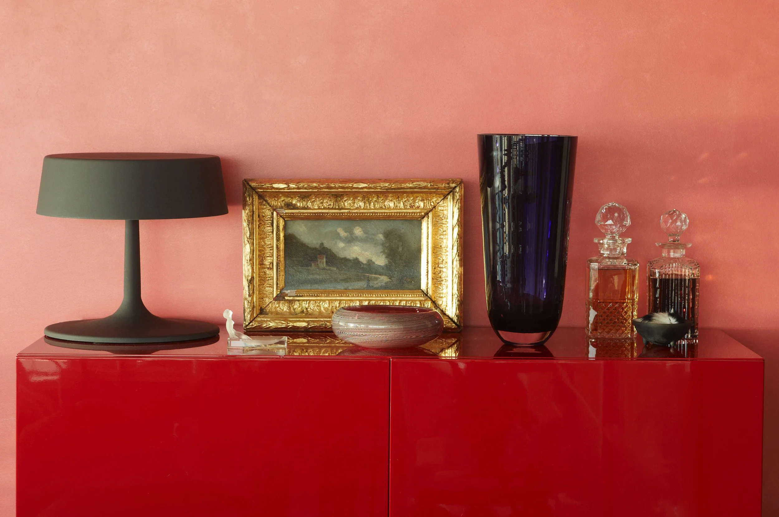
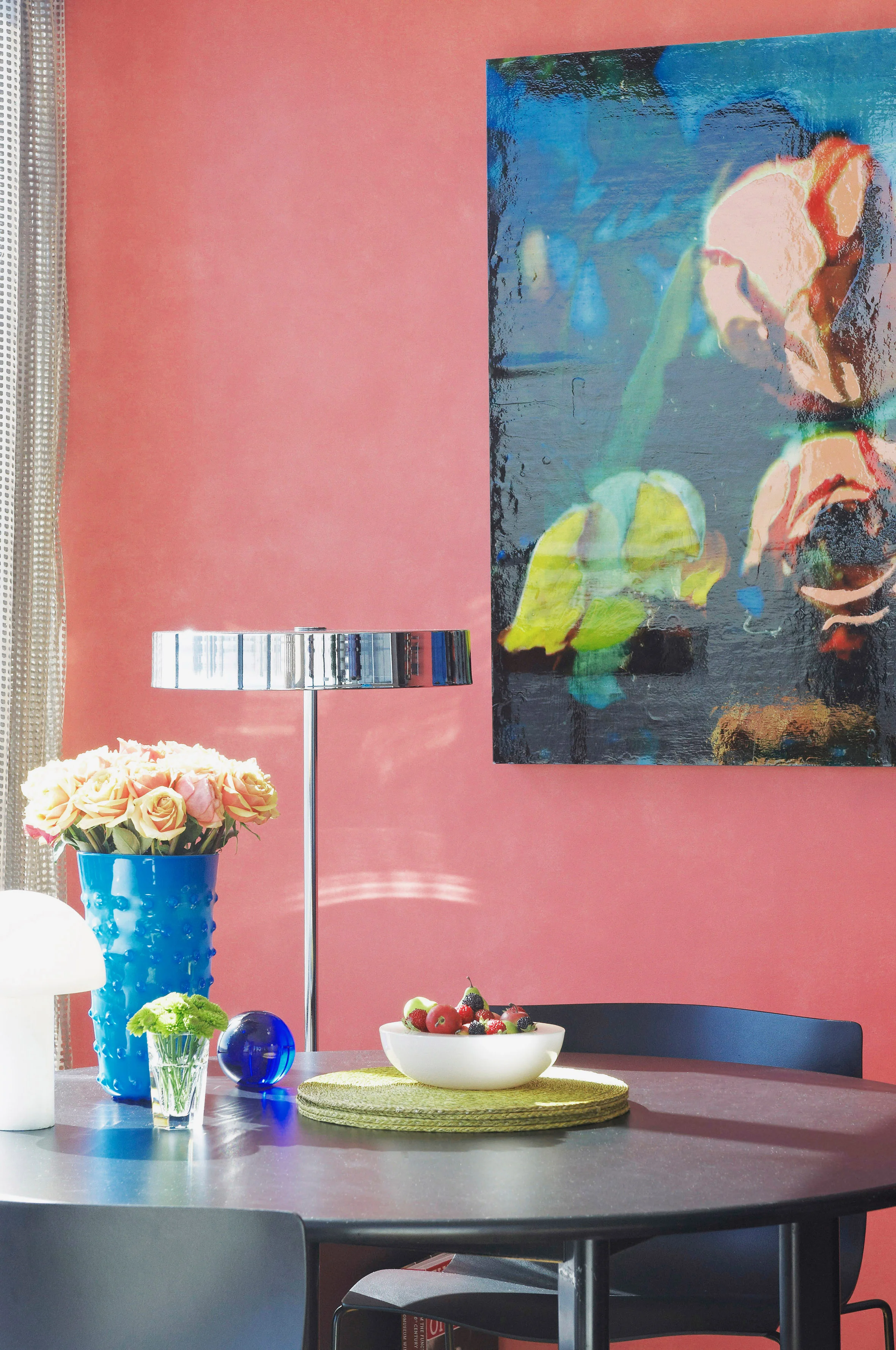
I have used Coral in my own home/studio, myself. I employed the same methodology/process I use with my clients, on myself. Defining color directions based on how they want to live and feel in their spaces. In deciding to add color to my own living room; I address my intentions first.
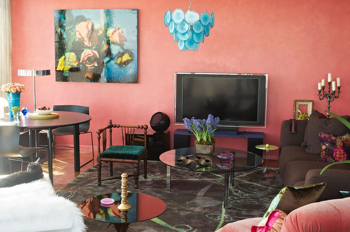
In my case, I decided that I wanted a color that represented myself. Strong, Sensual & Feminine. It was only then that I could establish which color represented that for me at that time, and in that light. Lighting is critical in establishing color palettes. I arrived at coral. Incidentally the year was 2009, colors do not know what year it is.
Color is a private & personal sensation. They are many factors that impact how and why we respond to color.
I choose to think of ‘Living Coral’ on a more positive note. It’s feminine! This is the year for women to have a greater voice - Women in Leadership.
Imagine if your spaces could reflect who you are and how you want to feel? Would that be more interesting to you, than Color of the Year?
Color makes up 80% of our visual perception. Color impacts our thoughts, actions and emotions.
One size does not fit all, how can one color possibly?